How to Become a Matting Master
Mar 20, 2018 | Decorate, Learn, How-To Guides
So, you’ve found the frame of your dreams and can’t wait to see what it looks like around your art. “But wait,” you say. “How on earth do I go about choosing mats for my picture?” Hey, we got you. Mats are nothing short of miracle workers for making your framed pieces shine in their greatest glory. Here’s a rundown of all things mat-y to get you on your way to becoming a matting master.
The Magic of Mats
With powerful cameras at the ready in our pockets, anybody can capture a masterpiece at any moment. However, circumstances like lighting, angle and color might not be just right, so if you’re not a photoshop expert, mats are a great way to add some pizzazz to your photos. That’s the magic of mats. They can take even a small, Instagram-ready photo and make it jump off the wall.
It doesn’t just stop at photography, of course. Mats can abracadabra everyday items into uniquely personal wall art. A postcard from a past adventure, the flyer from your rock band’s first show, your toddler’s finger painting experiments – mats can ensure they remain a tangible memory forever. How? Archival or “rag” mats provide a barrier between the showcased item and the glazing, meaning the item will be safe and sound for a long time.
Tip!
Acid is present in cardboard and other papers. Over time, the acid can leech and cause your valuable items to turn yellow. For best preservation, we recommend choosing acid-free mats. AKA Archival mats or rag mats.
It's a Wide World
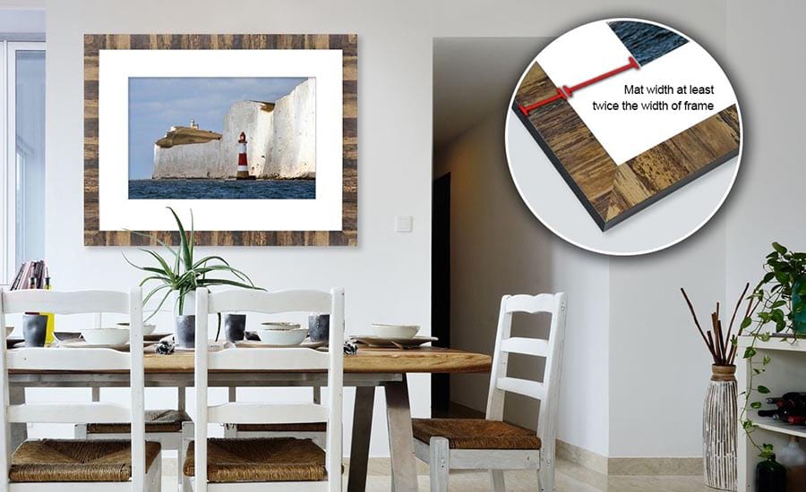
With mats there’s wisdom in widths. Sure, you may have the right color, but it’s the inches that can make or break your piece. Generally, wider mats emphasize the art and create a highly professional, gallery-quality presentation. On small pieces, wide mats convey value and importance. On larger pieces, they maintain balance and keep the look proportional.
As a rule of thumb, we like to choose a mat twice as wide as the width of the frame. So, if your frame is three-inches wide, a mat with six-inch borders will be magnanimous! It’s never an exact science, however. If you’re having trouble choosing how wide to go with your mat, our Customer Care team are mat-gicians, and can help you perfectly craft your mat.
Tip!
Found a wide frame you’re super in love with? You may not need a mat. Since wider frames are meant to stand on their own, we recommend using frames that are two inches in width or less with mats.
Zoe the Matting Maestro!
In Zoe Nadel’s art, the eye is extremely important. She observes the natural world and redefines it in her work through astounding use of shapes and color. So, you can well imagine that when it comes to framing her creations, mats play a pretty integral part.
Zoe is a matting maestro who values bottom weighting her mats. Bottom weighting simply means making the bottom width slightly wider than the top, left and right sides of your mat. This compensates for an optical illusion where it appears that your bottom mat width is narrower than it is. It’s a technique that can give your framed art an elegant, gallery-ready presentation.
Looking for some serious inspiration? Check out more of Zoe’s work!
True Colors
If you’re the feng shui type, you probably prefer the decor in your room to match up in perfect harmony. We love that kind of dedication. But when it comes to mats, it’s best to compliment the artwork, not where it hangs. Choose a mat no lighter than the lightest color within your art, no darker than darkest, and no brighter than the brightest. The goal is for the mat to add to your art, not take away from it.
Seem easy enough? Well, there are certainly exceptions. One customer of ours perfectly matched our mats to both her art and her bedroom. Photography has its own approach as well. Black and white is the tried-and-true choice for matting photos. It allows for the photo to speak on its own, while giving the presentation some unspeakable refinement.
Let’s dig in to the details of color a little closer:
Single Mats
If you choose to use one mat, try using a neutral color. But wait! Don’t immediately go plain white. While white is certainly reliable, there are approximately one gazillion hues you can browse. From Off White to Olde Gray, there’s a large variety of neutral tones that ensure you will make an understated statement.
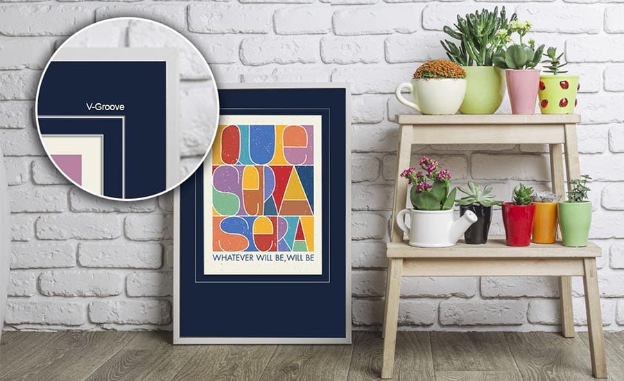
Tip!
Adding a V-groove to a single, dark-colored mat can give you the look of two mats for the price of one!
Bonus Tip!
When framing photos of people, we recommend using white mats with some warmth. Try our PM3293 Antique White, PM987 Palm Beach White or PM3340 Manor White.
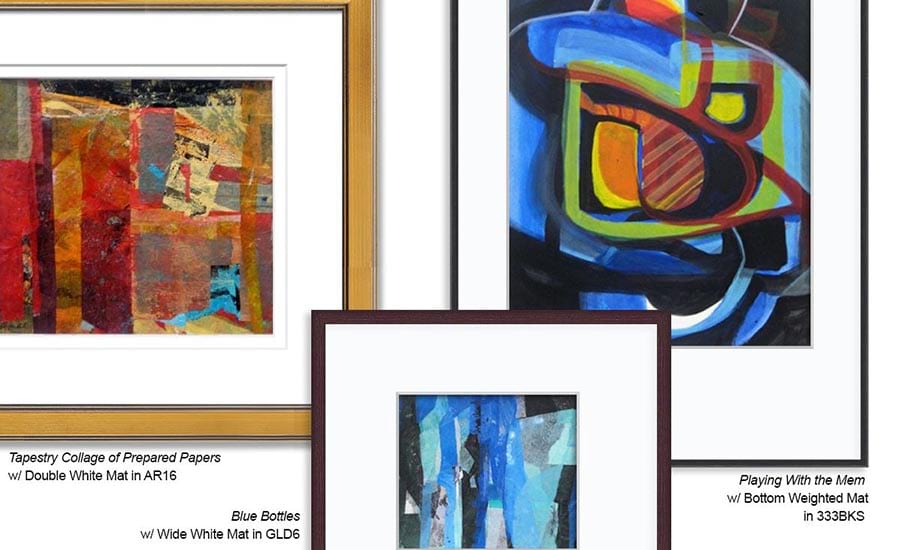
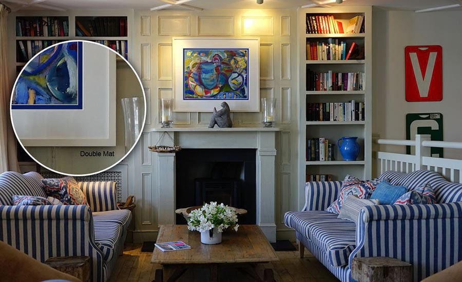
Double Mats
For some super “wow” factor, try doubling your fun. We like using a white or neutral color for the top mat then adding a punch of color that matches the dominant color in the artwork as the “reveal” (the inner mat closest to the art). This high-contrast, high-awesomeness treatment will give your presentation even more dimension.
Triple Mats
When you’re looking for some added depth and mega-dimension, adding a third mat may just blow your mind. Try using two neutral outer mats with a pop of color on the inner mat around your image. Your eye won’t know what hit it as it’s drawn inwards to your art.
Tip!
Keeping all your mats the same hue will soften the eyes’ transition across the layers. We recommend avoiding extreme color transitions, using two at most, and pulling from colors within the featured art.
Goodness Glazious
Pardon us if your mouth starts watering for a doughnut, but it’s time to talk glazing. Glazing is the clear front that holds your art in place so it doesn’t fall out the front. If you’re trying to decide between glass or an acrylic front, let us preach on the benefits of acrylic for a moment. Acrylic protects against UV damage and is half the weight of glass, while providing the same clarity. It is also shatter-resistant, making it safer and more eco-friendly than glass. All this makes acrylic a preferred professional choice for framed and matted presentations.
But which acrylic front to choose? For single mats, we recommend a non-glare acrylic. For double and triple mats, go with a clear acrylic to avoid your art looking out-of-focus from the added space created by extra mats.
Still can’t decide where to begin? We offer FREE mat samples, so you can check out the color and texture of the mat, see how it looks with your art and shop with confidence. Once you’ve created your mat-num opus, show it off on social with the hashtag #framingjoy so we can peep at it!
</div>